FREE DOMESTIC SHIPPING ON ORDERS $99+ | 100% SATISFACTION GUARANTEED
FREE DOMESTIC SHIPPING ON ORDERS $99+ | 100% SATISFACTION GUARANTEED
A column with no settings can be used as a spacer
Link to your collections, sales and even external links
Add up to five columns
A column with no settings can be used as a spacer
Link to your collections, sales and even external links
Add up to five columns
Add description, images, menus and links to your mega menu
A column with no settings can be used as a spacer
Link to your collections, sales and even external links
Add up to five columns
Add description, images, menus and links to your mega menu
A column with no settings can be used as a spacer
Link to your collections, sales and even external links
Add up to five columns
Add description, images, menus and links to your mega menu
A column with no settings can be used as a spacer
Link to your collections, sales and even external links
Add up to five columns
Add description, images, menus and links to your mega menu
A column with no settings can be used as a spacer
Link to your collections, sales and even external links
Add up to five columns
2016 Lookbook Green and Yellow
January 02, 2017 4 min read
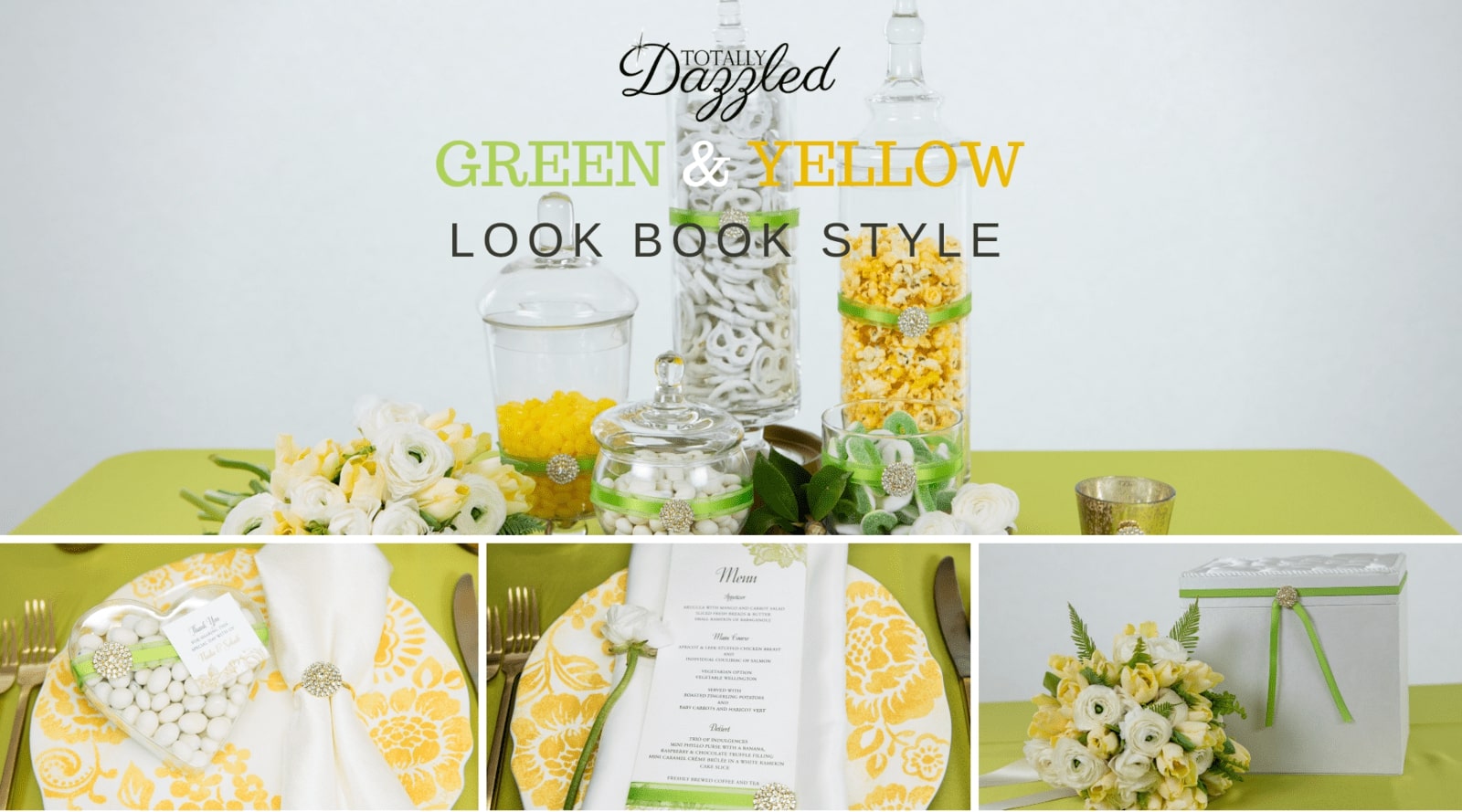
Green and yellow decor inspiration from our 2016 lookbook
Our (first ever) lookbook has been a total joy to put together. We were extremely lucky to work with very talented and creative ladies. A big thanks goes to the Distinct Occasions team not only for being an awesome pair to work with but also for adding so much value to this project.
Before I get into the green and yellow lookbooks style, it's important to mention that all of our lookbook images are great not only for weddings and big events but for things like home decor, market days, shop decor and of course, gifts. The green and yellow

Credits: Totally Dazzled 2016 Lookbook
While looking through the final green and yellow lookbook style images, I realized just how stunning this combination is with the hints of gold added. The trick when using colors together is always in finding the perfect combination. You may feel you'd prefer a brighter set of colors, or one muted shade alongside a brighter shade, there is no wrong or right here. Have fun playing around with your color combination and enjoy the lookbook inspiration. Let's get started.
Gorgeous Summer Style with Green and Yellow
 A lovely summer wedding tablescape. Dress it up or down with your favorite glam pieces.
Setting the table for your guests is an exciting part of organizing any event as it's the very place where they will spend a large portion of their time. It should be memorable and spectacular. There are always two ways of doing this. You can go for the aesthetic WOW factor or you could go for the sentimental angle. Sentimental in this sense not necessarily meaning that the look of your table is in any way compromised but rather that the focus is on the details that your guests will relate to. For this tablescape we decided to go with the sophisticated gold floral rhinestone flat back and the matching gold floral rhinestone napkin ring to add a bit of glam to the scene.
A Sweet Treat to Say Thank You
 Give a wedding or event favor that guests will enjoy
Whether you choose to go with edible favors, something handmade or something bought the packaging plays a big role in making it perfect. We've chosen to showcase these candies in a clear heart-shaped container and added a beautiful ribbon with a bling piece. The note, which is done in the same style as the wedding stationery is a great way of adding a personal touch. I love the idea of usingthe guests names and adding a quote, or a small message as a thank you. This gives the favor an added special touch.
A Simple Menu Accentuates the Design
 A simple but effective menu design
We've all heard the saying, less is more. For this menu design, we used a plain white paper and added only green illustrations to the top. We then embellished the menu card with the same green ribbon and bling piece to ensure that the look and feel is similar. Starting with a simple design often allows you to add and remove details at your leisure. if you prefer more sparkle and bling, play around with your favorite choices to get the look you want.
Pretty Design Details on Stationery Items Make All the Difference
 Wedding stationery with details that delight
This is such a pretty way to add depth to your wedding stationery while still maintaining simplicity. We added only one bling piece here with the green ribbon, but there are unlimited ways that you can spruce up your own invitations. The green line art helped to eliminate the stark white space. White space is great, always one of my favorites but a little too much or a little in the wrong place can be quite overwhelming and can often result in an incomplete look. If you're opting for a lot of white space, be sure to play around with understated details that aid the design.
A Candy Display In Green and Yellow
 Candy, anyone? This candy table looks amazing and will be a treat for the eyes long before anyone even reaches it
The sweets table is always an exciting area at any event or wedding and as the name suggest, it should be a treat for both the eyes and the tastebuds. Create gorgeous candy tables with beautiful apothecary jars and bling. This combination is always a winner!
The Perfect Summer Treat
 Candy jars blinged up with our gorgeous gold floral rhinestone flat back
Don't these jars look gorgeous? These candy jars are great for market day display jars and home decor too (because who wouldn't want a treat out of one of these special bling jars?) A quick suggestion for making use of your candy jars throughout the year and season - simply change the color of the ribbon to suit your theme, color choice or season. That's it. It's that easy!
Gorgeous Decor and Event Extras with a Touch of Glam

Tie your design details in by adding elements to all areas of your event
I always advocate pulling details through to all of your event planning areas. In doing so, not only do you create something unified but you create a sort of storyline that guests can relate to. Nothing feels out of place or unnecessary this way. Whether you have guest books, accessories, pew decorations, or any other items...tie them all in together with a small but recognizable detail.
Shop The Products Used In The White and Blue Style
Use any combination of bling pieces that suit your theme to bring your projects to life. Also, remember that you can breathe new life into your olod projects simply by changing a few key elements. They type of jar you use, the color and even width of the ribbon, the bling choice and the style of your design elements will literally change the look and feel of your decor pieces.
2016 Lookbook Styles to look out for
 |
 |
 |
 |
 |
 |
 |
Take a look at the Totally Dazzled 2016 Lookbook Pinterest Board


 A lovely summer wedding tablescape. Dress it up or down with your favorite glam pieces.
 Give a wedding or event favor that guests will enjoy
 A simple but effective menu design
 Wedding stationery with details that delight
 Candy, anyone? This candy table looks amazing and will be a treat for the eyes long before anyone even reaches it
 Candy jars blinged up with our gorgeous gold floral rhinestone flat back