FREE DOMESTIC SHIPPING ON ORDERS $99+ | 100% SATISFACTION GUARANTEED
FREE DOMESTIC SHIPPING ON ORDERS $99+ | 100% SATISFACTION GUARANTEED
A column with no settings can be used as a spacer
Link to your collections, sales and even external links
Add up to five columns
A column with no settings can be used as a spacer
Link to your collections, sales and even external links
Add up to five columns
Add description, images, menus and links to your mega menu
A column with no settings can be used as a spacer
Link to your collections, sales and even external links
Add up to five columns
Add description, images, menus and links to your mega menu
A column with no settings can be used as a spacer
Link to your collections, sales and even external links
Add up to five columns
Add description, images, menus and links to your mega menu
A column with no settings can be used as a spacer
Link to your collections, sales and even external links
Add up to five columns
Add description, images, menus and links to your mega menu
A column with no settings can be used as a spacer
Link to your collections, sales and even external links
Add up to five columns
Turquoise and Gold Wedding Inspiration
April 27, 2017 3 min read

Beautiful beyond words, turquoise and gold is an exotic spring color combination
The turquoise and gold is a color trend that I’ve been following for a while and I thought it would be a fantastic idea to add it to the spring collection. To be fair, I think this would make a great wedding color all year around with no distinctions as it can be styled both as a warm color combination or a cool color combination depending on the exact hues and metallic element used.
I’m in love with this combination. Smitten, even. I’ve been on a bit of a metallic fix for the last few months and I’m so pleased to see the gorgeous color and gold combinations still popping up. They’re a beautiful alternative to an elegant white wedding for those who want something extra or non-traditional. Gold and black is a deep and daring combination perfect for events but suited to weddings too. Coral and gold is another daring but stunning combination. We combined these two elements for the coral beach lookbook style and the result was fantastic.
If you’re not a huge fan of gold, though, remember that you can always combine turquoise with copper for a more industrial look and a rose gold for that soft, wispy feel. A silver and turquoise would work brilliantly too for a stunning cool winter wedding theme or that super fresh summer do.

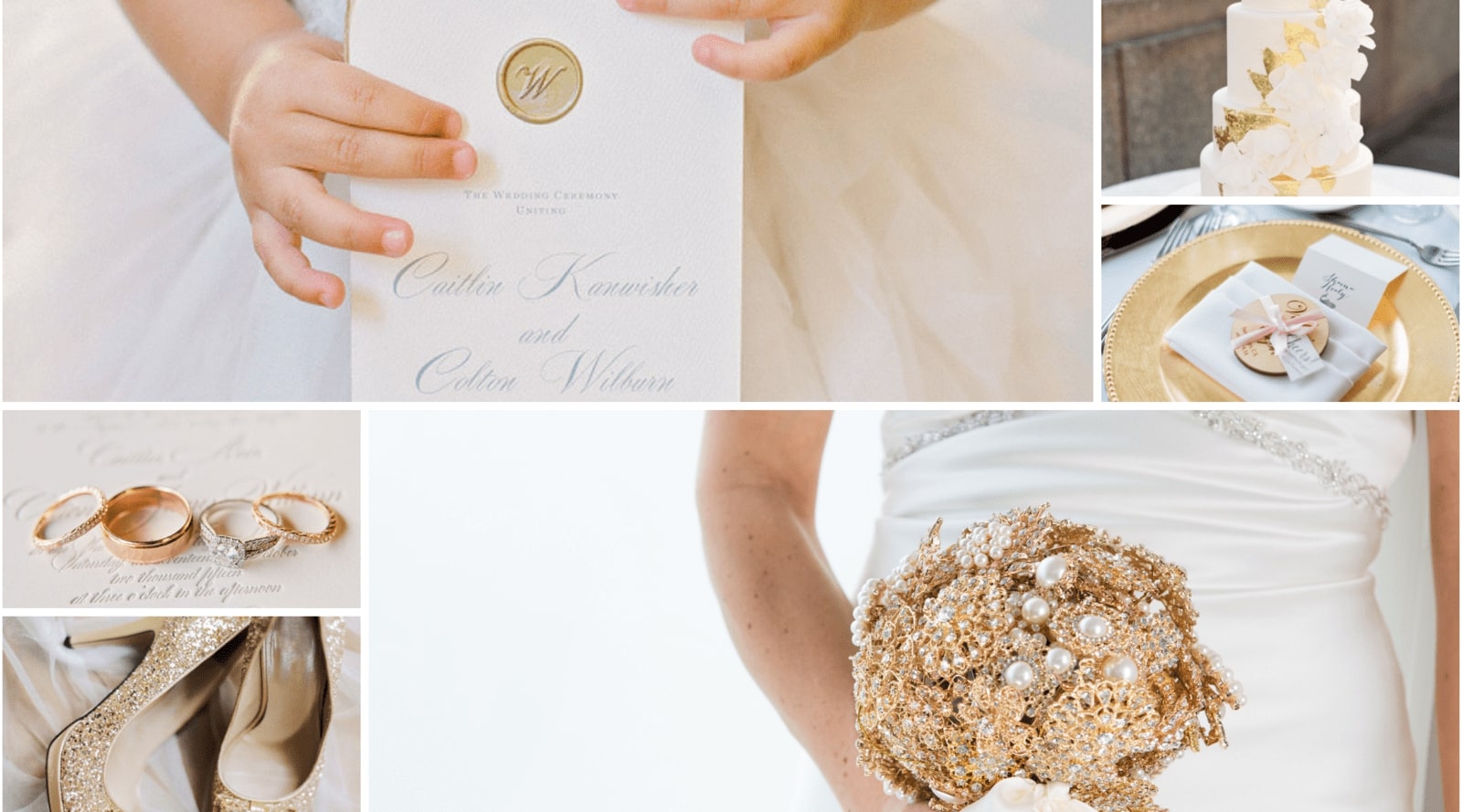
Credits: Table setting: Photography by Laura Goldenberger via Found Vintage Rentals; Place setting: Caroline Tran via Chic Vantage Brides; cake: via Colin Cowie Weddings; Flower Girl: Bailee Boos Boutique via Mod Wedding; Shoes: This Love of Yours via Invitations by Dawn; Napkin Rings: Totally Dazzled.
What stands out, at first, to me about this color combination, the turquoise, and gold, is that it’s beautifully elegant but not stiff. There’s a slight playful feel to the turquoise while the addition of gold adds a touch of sophistication. It’s warm, inviting, and charming. I love the idea of using the gold floral rhinestone napkin rings as the rhinestones pick up the color of the surrounding tableware elements. The design of the rhinestone piece also has a stunning timeless charm to it that I absolutely adore. The matching gold floral rhinestone flat back would be a great option for invitations, menu designs, tableware items and wedding favors.
The choice of fabrics and the varied types of textures you use could also potentially change the feel of your wedding design quite a bit. For example, the luxurious blue velvet tablecloth in the collage above is absolutely stunning. This detail immediately adds warmth to the entire table, despite the fact that the color leans more toward the cold side. It’s a stunning contradiction that I’m sure guests will pick up on, even if it is subconscious.
Adding little detail gems for your guests can sometimes prove to be quite challenging. However, if you’re up for the challenge, the small details will be what your guests talk about long after your wedding. In the collage, I adore the gold-foiled menu design, typed out on a plain white card stock with slightly rough edges. It’s a very small detail but it’s beyond beautiful and it simply ties the entire place setting in perfectly.
If you’re out of ideas for place settings, though, you could consider using a simple napkin fold with the beautiful gold floral rhinestone napkin ring and you’re good to go. Explore this color combination and have fun with it. Let your imagination run wild.
Featured Products
Take a look at the Turquoise and Gold Pinterest Board


